Last week we unveiled our new logo and while we hope the transition looked seamless to you, it took a lot of work behind the scenes to design this new representation of our company.
As an organization that works with so many different aspects of technology, it's hard to represent all that we do in a single image. But, at the heart of our company, we work to integrate technology systems and business teams in order to find the best solution for our clients.
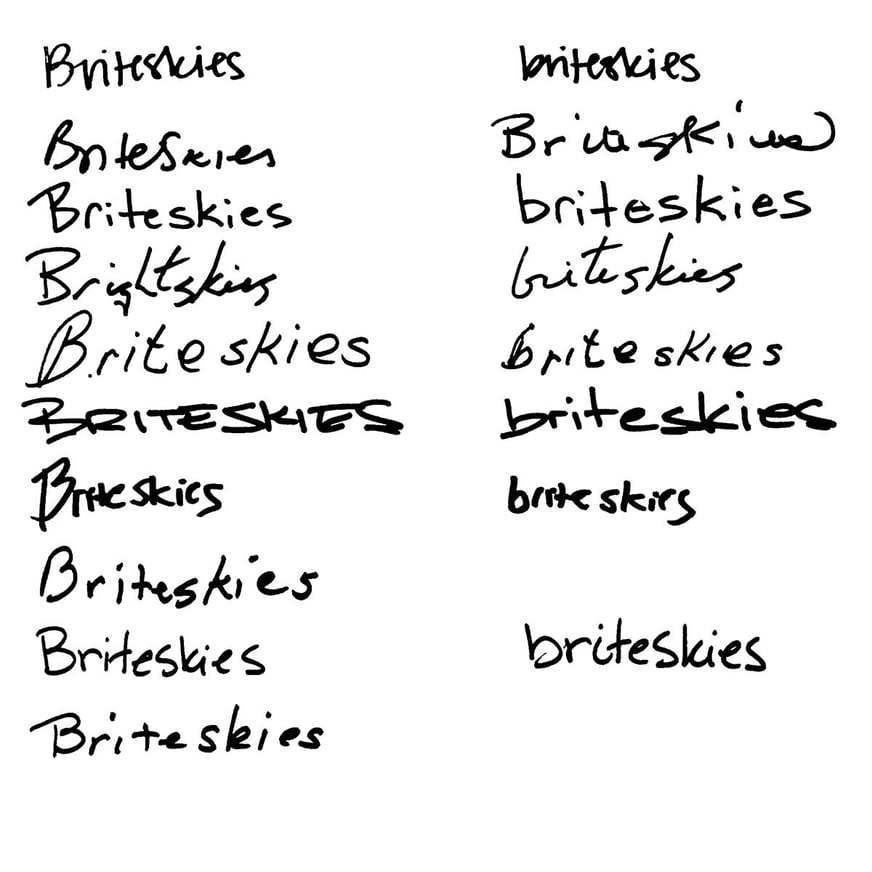
When we started our rebrand process, we studied the handwriting of everyone on our team to look for typographic inspiration.
Then, we explored options to highlight the "b" in Briteskies, but ultimately didn't feel a strong connection with these symbols. ![]()
We knew we would like to incorporate an icon in our new logo, but we needed it to represent our various service offerings without leaning too "stock photo tech logo."
We looked to our offering graphic (as seen on our home page), used on the site and in presentation materials, for inspiration and we focused on the integration symbol.

Whether it means integrating eCommerce with ERP systems, or integrating our team with a client team, pulling together all of those skills and features is what we do best. We pulled out that image and created an abstract representation of the integration concept to use as our new logo.
![]()
After many rounds of angles, arrows, and line-weight explorations, we were ready.
![]()
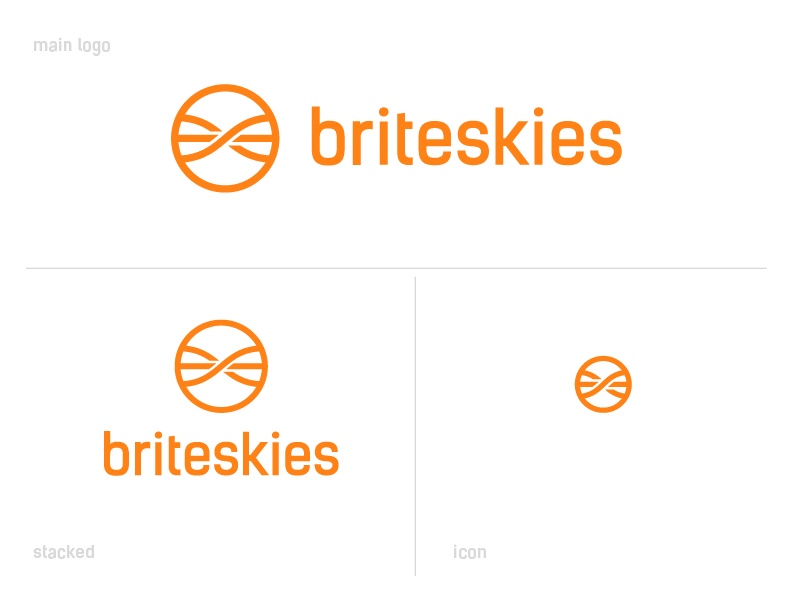
We have come a long way from the MS Paint logos from the past. Our new logo represents our forward thinking and revolutionary business practices as well as our eye for design.
![]()
Our new logo is more flexible and works well on our website and social media profiles and the stacked version is perfect for our new water bottles and mugs.
We're so excited to finally share our new logo with you, and we hope that this peek behind the scenes gives you some insight into our design process.
Is your organization looking to take on a big design project? Contact our team to see how we can help.
